Korbel California Brandy
About This Project
Korbel Brandy was in serious trouble. The brand had become regarded as stodgy and cheap, something only your grandfather might drink, with sagging sales at prices of $6.99 a bottle or less. The executives at Korbel knew that they had only two options: overhaul the brand or kill it entirely.
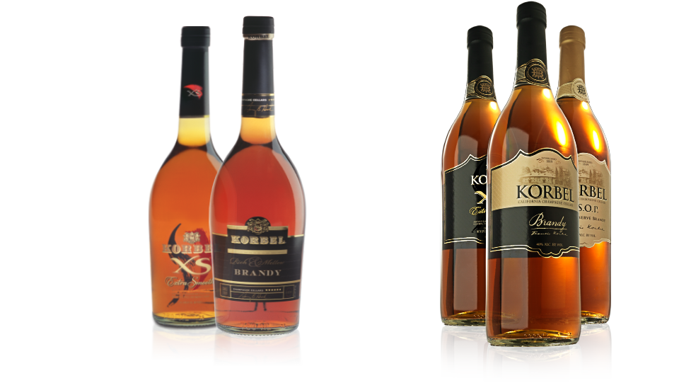
We took this legacy of sophistication and refinement through an evolutionary design process and updated it to modern times...
HeckArt Studios was given the opportunity to fix a problem that was immediately apparent to us, but not to those within the company, who were too close to see. We applied the ancient Chinese proverb “Look In Pot” to the search for the answer.


Since all parties recognized the status quo needed to be completely discarded, HeckArt Studios was afforded the rare ability to approach the rebranding of Korbel Brandy with carte blanche.
Using Look In Pot methodology, we searched for the gold hidden deepwith in the past. We scoured the archives, reaching all the way back to the 1800s, and saw how the brand had started, a handcrafted spirit of superior taste and quality.
We took this legacy of sophistication and refinement through an evolutionary design process and updated it to modern times, leading to a revolutionary package design that showcased the commitment to handcrafted distinction embodied in Korbel Brandy for over 100 years.In a year when American brandy sales were down for the first time in fourteen years, Korbel Brandy sales saw an increase coinciding with the release of it’s new package.

Before / After